Introduction
It’s been a long time since I put together my thoughts about a piece of my wildlife art. Before making “Test”, it had been also a long time since I felt I wanted to do so. The majority of my time at the drawing desk is taken up with small works. Also, the British market is interested in British fauna – makes sense (we can’t ever get enough barn owls!). I’m steered chiefly by local demand these days. Still, I feel a strong calling towards the wider world of wildlife, and its ongoing protection.
My “Home” series
The “Home” series is quite close to my heart – one might argue more meaningful than anything else I’ve done. With regard to any professional “legacy”, pieces like “Test” instil a real sense of pride for me. It’s also a huge bonus that I can raise funds for Greenpeace and Invicta as I go. With these works, there is no trade-in or limitation on detail and environment. They allow me to exercise the boundaries of my artistic ability, and also my patience as a human being!
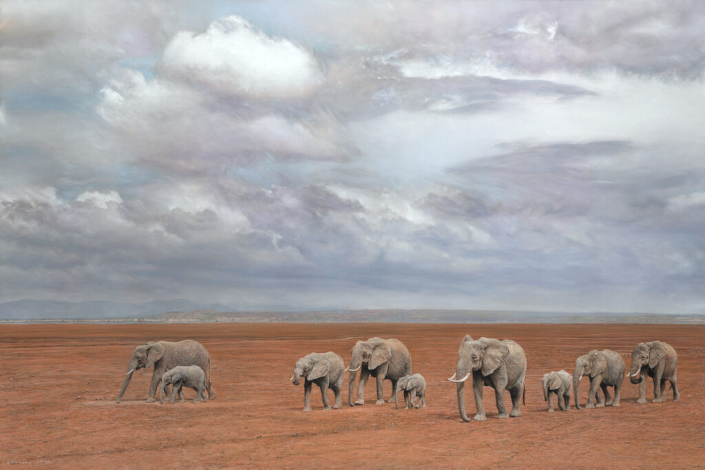
Firstly, I’ll talk about the size of this piece. The space is 90cm x 60cm, or around 3ft x 2ft. There is a number of reasons for using this size:
- it gives me a commonly used aspect ratio and neatly divisible working area, so I can work in bite-sized sections, without ruining my back! I always work on the half that’s closest to my body, before flipping the piece and working upside-down on the “top” half. This doesn’t let me dance around the surface like all those naturally gifted artists I admire, nor does it allow me to view the piece in full as I go. However, it makes the whole piece a little less daunting and more manageable.
- it is the maximum size piece my desk accommodates. I’ve toyed with the idea of pinning larger format surfaces to the wall of my office, but…
- …the largest size (140cm x 100cm) can be difficult to source, and presents a storage conundrum when not in use. I think I’d need a huge, dedicated standing desk. The piece would still be tilted upwards a little to save the worst of a dusty mess on the floor.
- all other pieces in the series are the same dimensions! I like this sense of uniformity. They’re all currently landscape orientation, too. This is fitting, given the focus on landscape and environment in each piece.
The Technical Bits
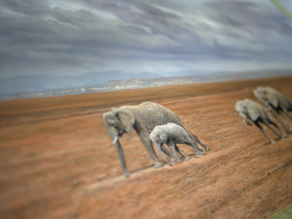
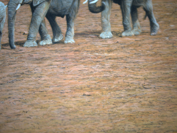
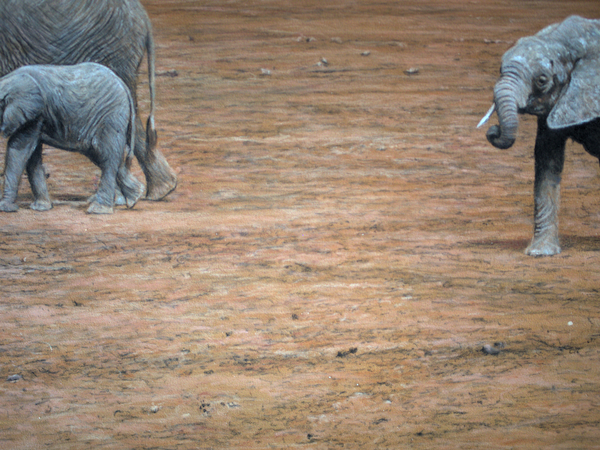
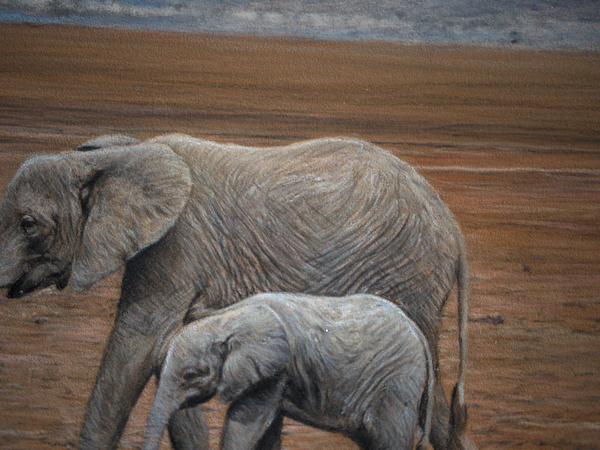
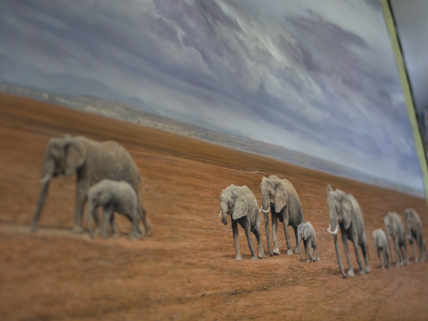
Where and how to start making “Test” was quite obvious to me. I’d start by tackling the swathe of rusty orange in the dried out Amboseli Lake bed. I’m normally wary of filling the pastelmat tooth too early, so I just skimmed the whole area enough. This covered the pastelmat colour with some pigment, roughly in the ballpark of what I wanted. I’d need to go over some of this area with lots of greys where all the elephants were positioned. The elephants echoed the rusty colour quite often anyway, so I wasn’t too precious about keeping these sections of pastelmat clear.
From here, it was quite a laborious slog to achieve texture on the lake bed. I just had to stay fairly methodical about it. I used various browns and fleshy colours to depart from the dominant “rust”. This lent some variation in values etc, so it wasn’t too plain visually.
There was faint evidence of shade, undulation or moist clay in some parts, and the odd trail or “desire line”. I carefully focused on these, which helped break up the potential monotony of the lake bed. Some of this necessarily included some dark greys, but I always have to steer on the right side of this colour, to avoid a piece becoming too “muddied” by it. It’s my privilege as an artist to have so many vibrant colours at my disposal. However, I like to thread grey values through much of my work. I’ve always seen greys a secret weapon for instilling extra realism into a piece. I guess it forms part of my little artistic motif.
The texture visible in the ground was sort of scribbled in with greys. I found it more important to see a sense of flow than achieve painstaking detail. I dotted the highs and lows around very sparingly, to depict loose rocks or soil, without drawing too much attention away from the elephants. This is key when making a background that balances a piece of work. You can spend an awfully long time working through weeds, gravel, grass and more. Too much attention on this can often just pull focus away from your subject, so it’s important to stay mindful of this.
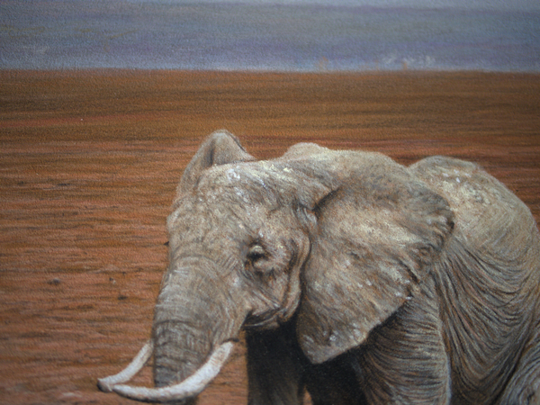
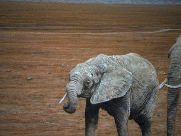
The elephants themselves presented a considerable challenge. On quite a small scale, colour pencil has often been my crutch. Sharpening pastel pencils isn’t my favourite hobby, so it was a case of finding the sharpest “edge”. Gliding across the pastelmat with it lightly results in quite sharp lines. Here’s a brave zooming in to these little characters! As you can see, this isn’t the most detailed work I’ve ever done. However, these days I do prefer the textures pure pastel gives me over the high level of detail granted by colour pencil.
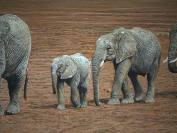
The elephant hide put me in a bit of a cross-eyed state. I must have re-worked those textures about 4-5 times, per elephant! There’d be no other way of getting round it though, since this was an inescapable focal point. The lights and darks thrown up by the direct light were tough to render, especially as they neighboured each other so closely. This was the most technically challenging aspect by a long way when making “Test”.
By a certain point, I’d filled the pastelmat up on the elephants. I added the ivory coloured spots on the heads of some of them in blind hope with a Unison stick. Luckily Unison is among the most vibrant of pastel brands, and I got away with it!
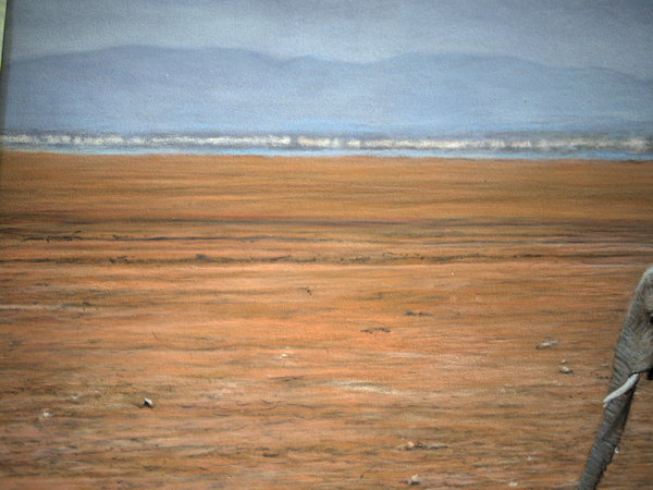
Etching in some little horizon details was quite therapeutic. Nothing was identifiable so far off in the distance. I think I could make out some giraffes in the reference image, blurred by little mirages created by the intense heat. The important thing here was to convey a sense of distance by sticking to a fairly desaturated palate of colours.
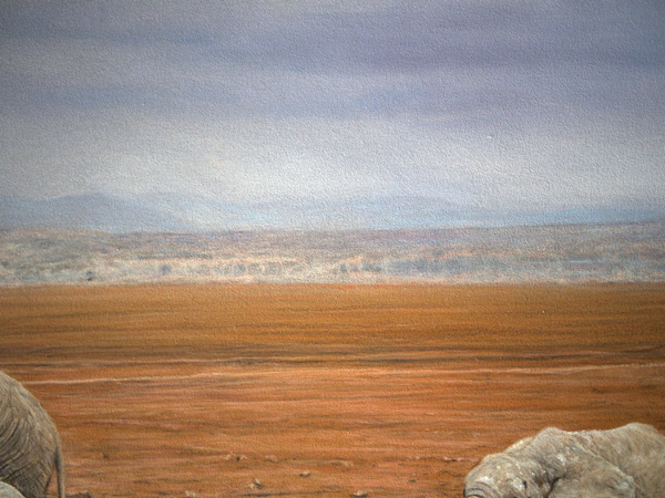
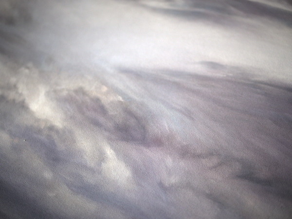
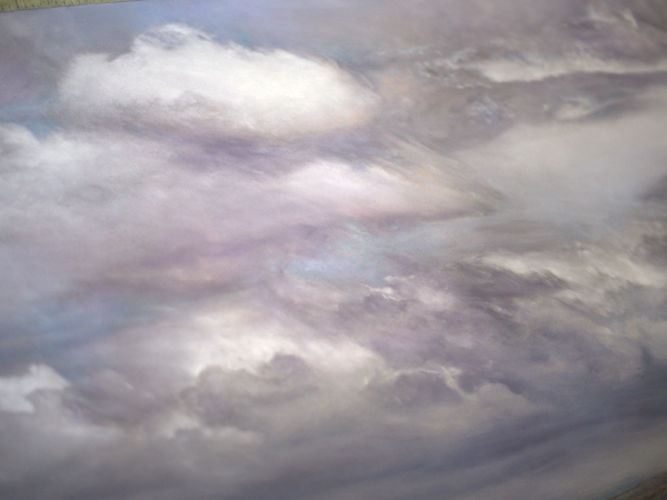
Flipping the piece upside down, I felt the handbrake come off. I moved across the cloudy sky with an air of freedom. I’ve discovered a bit of a surprising knack for skylines and wispy clouds in the last year or so. “Advance“, and “A Spirit Wreathed in Light” demonstrate this quite well. There’s not much resting on accuracy and detail, so it’s quite a relaxing render. I mostly made up this area with PanPastel and sponges, to achieve a smooth result. Unison pastels often leave quite bright markings that are hard to blend fully, so I kept away from these in general, save for a few highlights. I then finessed the cloud shading with a very light application of Carbothello pencil. I followed with a soft brush, to smooth the area again.
Naming the piece “Test”
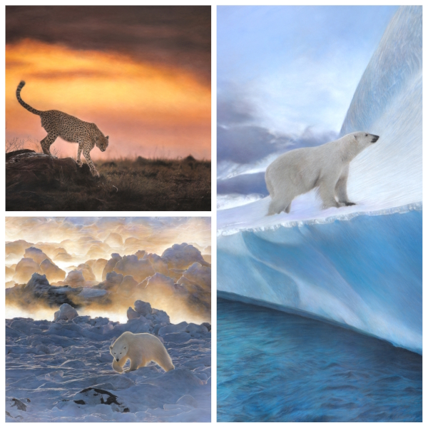
I’ve gone through a bit of a sea change in the naming of my wildlife art. I left behind the rather stale habit of names like “Red Squirrel” and “North American Barn Owl” in favour of succinct descriptors, such as “Success” or “Scouting”. More recently still, I’ve plucked lines from old poems which might encapsulate a feeling, or the soul of the animal (e.g. “A Spirit Wreathed in Light”).
This was a herd of elephants roaming the well-worn paths of their ancestors, whose remains may well be hidden beneath the earth. I was toying with the idea of naming the piece “A Richer Dust Concealed”, but I couldn’t misuse such a clear reference from “The Soldier” by Rupert Brooke, for all the notions of patriotism too readily conjured and not so fitting.
“Test” is hopefully laconic and direct, telling a portion of the story of a hunt for water. This is one of those pieces I’d like to think can tell the rest of the story through the power of the image.
Closing thoughts on the making of “Test”
I spoke to another artist recently, who confessed to having been equally bewitched by works from the likes of Stella Mays, Eric Wilson, Robert Bateman et al. They each have something in common for me; the ability to use atmosphere and environment to create a real story in their work. Each time I view something of theirs, I feel like I could walk into the painting, or maybe see something new for the first time.
Meeting Stella a few years ago was a real highlight. My first visit to the Exhibition of Wildlife Art was, very fortunately, as an exhibitor, and indeed as a fan of wildlife art in equal measure. Stella had just come off the back of a “Runner Up” award at DSWF Wildlife Artist of the Year 2021 for her spellbinding pastel painting of a polar bear. And there it was in the flesh!
I spent long enough gawping at this, and her other works, for her to finish another conversation and notice my awkward presence. I’ve always felt a little peculiar because of my height, and how skinny I am and the way I carry myself, having described myself as an imagining of Tim Burton. Stella was of course completely unphased, debonair, affable and gregarious, and really kind about the work I’d brought along. I paid due deference to her, silently undercutting myself as the artist I am, following an irresistible urge to “compare”. Even though I was around two years in to the “wildlife” portion of my art career, I knew I hadn’t really even begun! My eternal thanks to her, and to those like her.
While this piece doesn’t strictly pay homage to my aforementioned wildlife art heroes, I know I wouldn’t be making the art I make today without their influence, which I’d find very hard to deny. I’m very proud of all my contributions to the “Home” series, with this piece in particular cementing its place as my home page banner.
Contact me if you’d like to hear more about the availability of “Test”.

Recent Comments