Well, the initial response to the piece of work itself has been staggering. Thanks to everyone who’s flung it around the internet in one way or another.
It felt like the perfect way to continue getting my pastel technique up to code, without it being a throwaway operation. I don’t ever practise – every blank piece of paper is intentionally converted into (hopefully) something of interest. Perhaps it’s cynical, but my drawing time has to be used directly or not at all. So many hours are spent batting at the stumps, I can’t just loiter there after the bowler’s gone home…if you like obscure, nonsensical cricket analogies. And I DON’T.
One of the chief causes of these fires has been record, oppressive temperatures. When you add arson and obstructive legislation, you lose 95% of your koalas, and plenty other species on top of that.
Good old humans. Stunting the entropic, unfettered rate of reproduction is, to my mind, the only paved way to avoid future crises like this. A labrador has a bigger carbon footprint than a regular-use 4×4 vehicle, so the impact of one human is off the charts by comparison.
I’ve been met with a little friction on this in the past. It’s been mistaken as a direct prod at family values. Child-free females are bombarded with questions regarding their omission. Child-free males get quite a few, too. I can even understand the line of questioning/bafflement – everyone comes from an extremely long line of people who had children. I have an answer for each, coupled with a rhetorical counter-question regarding election to have them, but I’ll only get into that if I absolutely have to.
I love the families around me, I’m delighted for them, and also full of remorse for anyone without one and wanting nothing more. But in choosing a child-free life, you start looking over the mound at wider problems that’ll affect everyone horribly, unless something changes. At some stage, the choke-point on this kind of discussion has to be undone, and until then, it’ll be in the margins.
(He said, printing 50 sheets of paper and ordering as many delivery tubes. But I don’t have to drive to work any more, so I’m throwing that onto the other side of my little personal carbon ledger to pretend I’m a good person.)
ANYWAY, enough of the “Fleming 2024” manifesto, and to jump down off my high horse. This little appeal is about the here and now.
50 prints are available, and with all you’ve kindly exposed on my behalf on social media, the wagons are starting to circle. A wholehearted thanks. Whatever proceeds this can generate will barely make a dent, but it’ll be something!
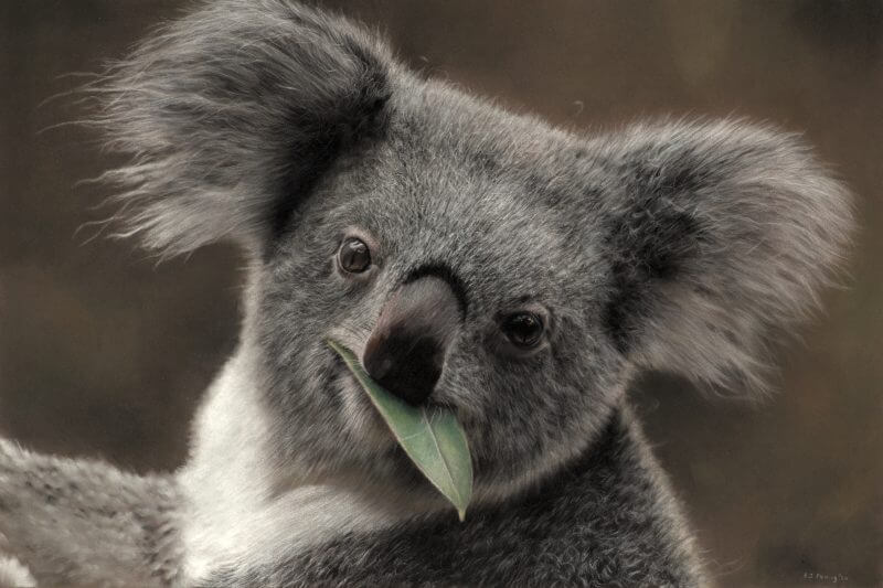
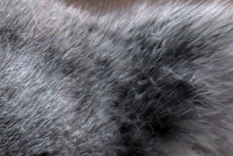
A closer look at the piece…
PanPastels have been a bit of a revelation. Powdery pastel “painted” on with a sponge. This photo’s one of my own, and as such, I haven’t got the colour profile quite right, but you can still see the gentle transitions they offer with little effort needed. I look forward to painting the smoothest bokeh of my career with this stuff. All in good time, Fleming. All in good time.
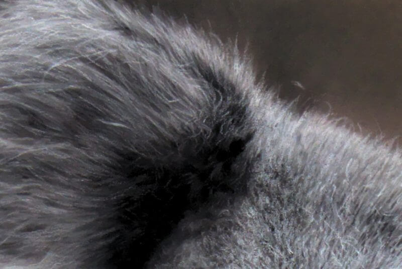
Stray hairs, occasionally applied by “cheating” (using a white Polychromos pencil). I’ve still not managed to properly sharpen the pastels, but I’m slowly getting the hang of it. In the main body of this picture, you can see the various stages of: black, overlaid with dark grey, lighter grey, off-white, then white. Layering has never been so easy. Pastels are extremely forgiving.
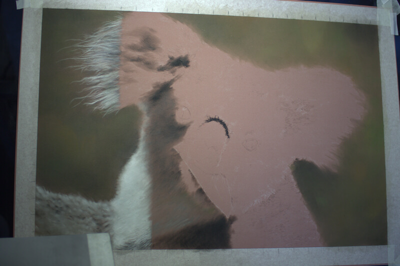
Note the brown Pastelmat paper showing through in places. I don’t mind leaving some of it bare. What’s the point in choosing a certain colour if you don’t?
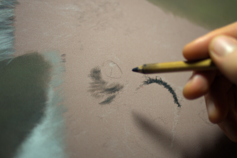
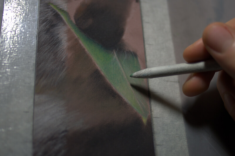
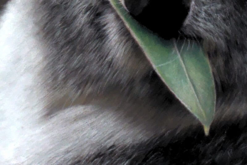
The part I thought would be the easiest turned into the most challenging. The leaf. I’ve discovered a healthy wariness of delicate tonal changes in a small area. PanPastels won’t save you now, Fleming! I used the Pitts, and a blending stump. Took a long time, as the leads are hard on those. I’d buy softer-leaded pencils, but I’m toughing it out until someone buys me a studio where I can store all these “some day” supplies.
In the shadows, I went over very lightly with an amber shade (these Pitts don’t have names, only numbers it seems). It made all the difference, and suggested some reflected light from an amber object nearby, or an amber undertone to the fur. I haven’t decided which.
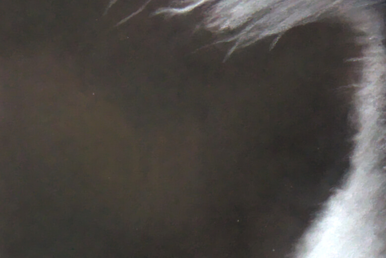
Eyes – we have orange and green reflections, suggesting electrical light sources, I suppose. I wasn’t too hung up on “authenticating” the photo by taking this human aspect away from it. I think the reflections were quite nice anyway.
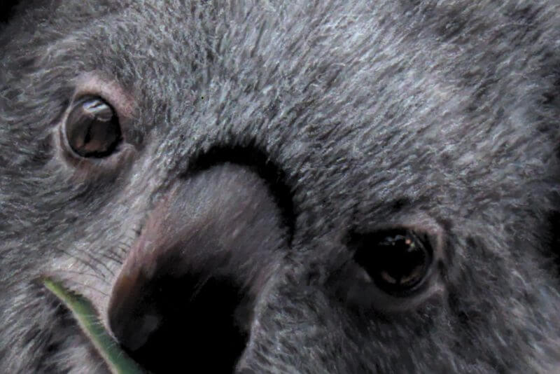
VERY subtle application of sky blue, turquoise and pink into the white fur. Just for a little more variation.
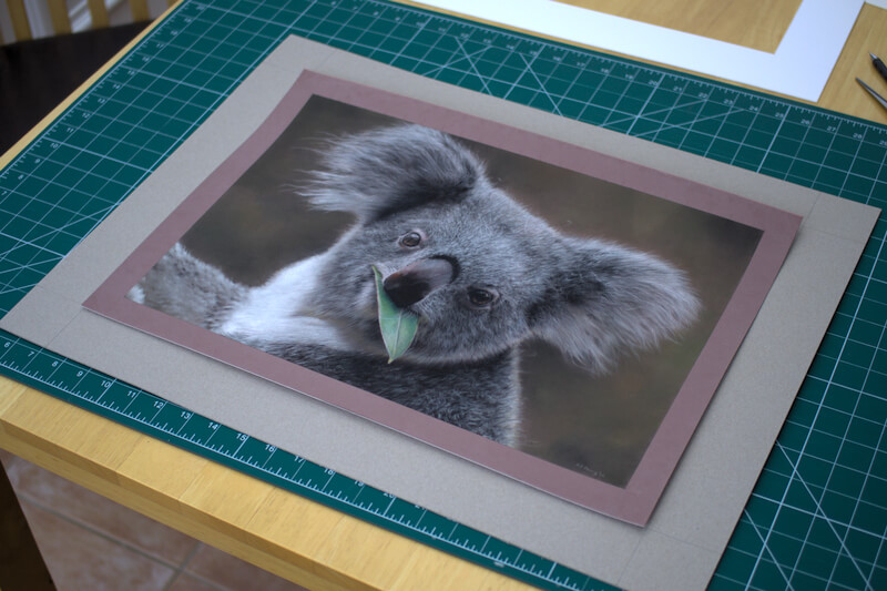
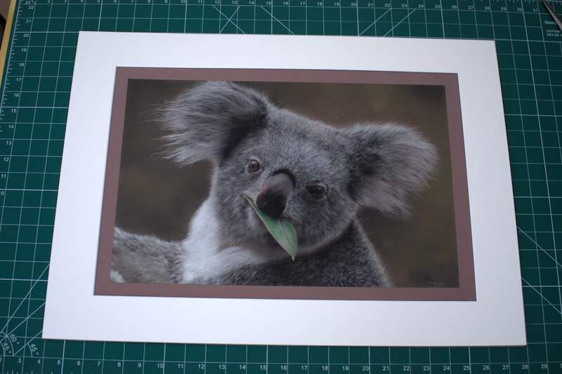
Mount, matte, frame. Badum-tsh.
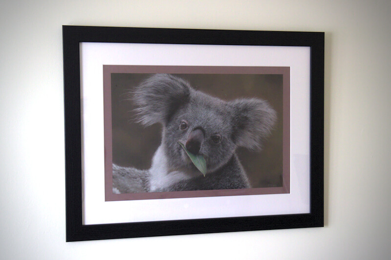
100% of the profits from the sale of the original and prints will head to WWF Australia. Please click here if you’re interested in buying a print.

My goodness! He looks like a stuffed BEAR! I had to zoom in to find the imperfections that I just knew there would be..Some proof that this was just an illusion. But there were NONE! Just fuzzy thick fur! Bravo Sir Fleming on this brilliant piece of art!
Thank you Debbie, it’s all as a result of examining each area as closely as possible and just moving along in bite-sized steps. Nothing special! Thanks again