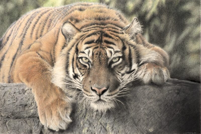
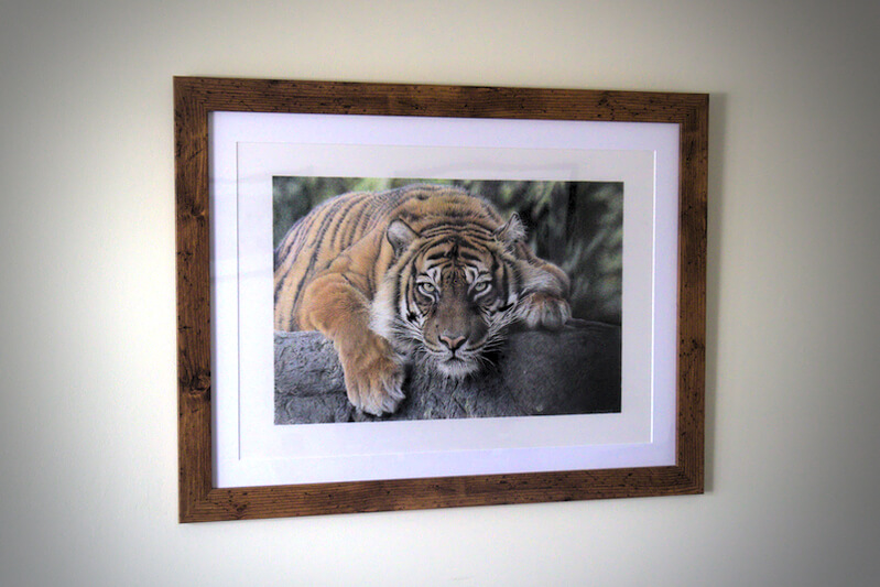
“Sumatran Tigress” is now done, with thanks to John De Greef for the reference photo. Post-match analysis below.
Back to the bad old days, most likely 90 hours spent (a rough guess, although I’m going to start counting vigilantly from now on). I was tackling new paper, sizing and methods, so I don’t regret treading softly if it means hitting the mark. Lots of upside-down drawing, mostly for the simple reason I’m not craning over the drawing board to reach up top, and straining my shoulder/back. I’m a weak little critter.
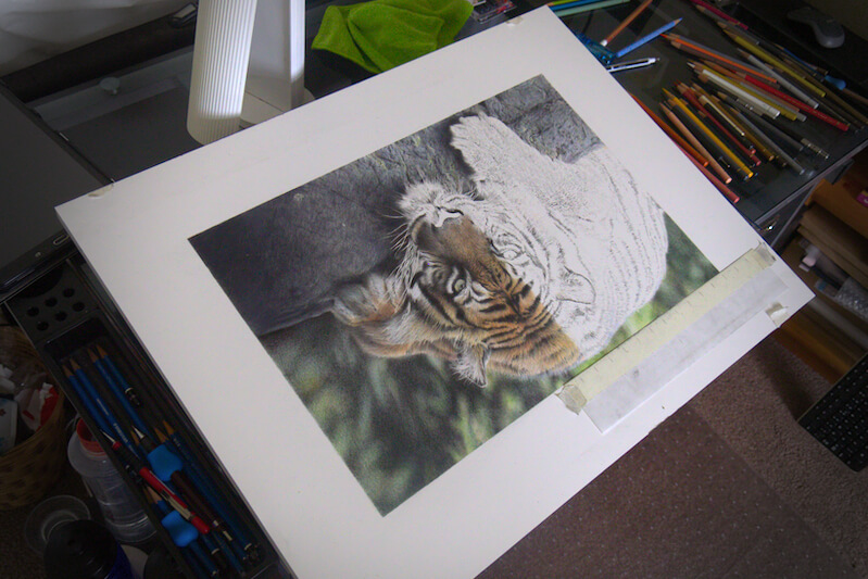
Arches Aquarelle is super robust paper. I had to resist the urge to have a fight with it, and still my tendinitis flared up a little in the process, unlike with the recently discovered drafting film, which has virtually no “tooth”, allowing you to glide around. This paper is like the Himalayas by comparison, a black hole for pencil lead. It chewed through my supplies like they were going out of fashion. All in the name of being able to blend with a new technique – addition of Gamsol solvent.
Talking of which, the rock in full daylight was left as-is, and same goes for the tigress’ face, for those strokes to pop out. The shadowy rock (bottom right) blended into the extremely dark mass that it now is, using barely any solvent, and I had to style out the transition towards the brighter rock with some light/intermittent blending I hadn’t intended to go ahead with.
Lucky me to have dealt with that area first, as it gave me enough information about darker colours treated with solvent. I decided to steer well clear of this method for the background, as I was bothered about losing control again.
I know how I can react when I get something wrong: correct, and over-correct, and wildly over-correct, and then erase an entire area and start again. With solvents, I don’t have this option. The pigment dissolves, and some of the colourful soup I’ve created sinks right into the paper, rendering it irretrievable to an erasor.
Hence, for blending the background, I chose to burnish. This means pressing hard with a colour pencil, flattening the tooth of the paper and bullying the pigments into a fairly convincing alliance, while giving the area a subtle glaze of whichever colour you’ve chosen to tamp it all down with. You can use any colour to achieve this – white being a popular one – but I chose a warm light grey, to mute the background a little while blending it, without washing out the colour too much.
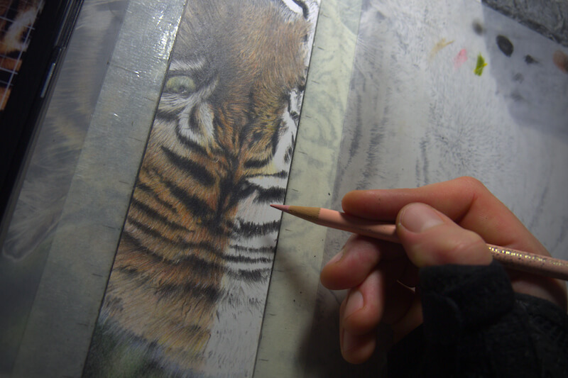
The solvent blending really came into its own around the lighter fur shades of the out-of-focus torso, and especially in the transitions between grey and peach, which aren’t that congruous. A miniature paintbrush was absolutely essential, even when blending broader areas. I’m not quite sure why. The bristles in question had a lot of give to them, so maybe they were less inclined to lift the pigment and leave white paper behind like others seemed to.
I’ve learned a damn sight more about layering on this one than ever before. “So many layers!” Do I have my Polychromos hat, badge and gun now that I’ve said that?
I didn’t think any colours could layer on top of black until I saw a tip from Bonny Snowdon about base layering and glazing with the Delft Blue pencil. As horribly wrong as I could be, this shade didn’t seem quite the ticket for these particular blacks, but I used Blue Violet instead to try achieving a similar effect. The result was far more palatable than the jet black I’d planned, so here’s to Bonny.
Somewhere around 40 different colours used in total, but the main players were…
Tiger: orange glaze, light cadmium yellow, brown ochre, pompeian red, sanguine, light flesh, sky blue, purple violet, warm greys, Payne’s grey, black
Eyes: light yellow ochre, sky blue, earth green, brown ochre, Payne’s grey, black.
Rock: Black, Payne’s grey, cold greys, ultramarine, cobalt blue, may green.
Background: pine green, chromium green opaque, earth green, permanent green, green gold, Payne’s grey, black.
If you’d like a print of this piece, please register your interest here, to be notified first, by email, of the release of limited edition prints. A percentage of all sales will be donated to the World Wildlife Fund.

Recent Comments